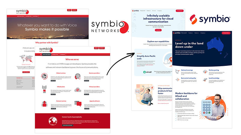
Symbio: 'The platform for modern communications'
...except the brand was 10+ years old, using a dated logo, coloured red with old fashion greys and a website built on an barely functioning platform - this is where I stepped in.


The company was rebranding from 'Symbio Networks' to 'Symbio' which is short for Symbiotic. Symbiotic is the relationship between two parties interacting with each other and mutually benefiting.
This is why I chose to keep a resemblance to the yin and yang icon the logo used to have, except I've modified it to resemble speech bubbles because the company is all about telecommunication.
I used the curve of the speech bubble and added it to the letters y & b not only to add design but to help create a visual vector bringing the viewers eye naturally across the logo from the icon > down to the y > up to the b > and then to the o.


Deep dive
Rebranding one of Australia's largest Telco's to expand into the APAC market
The problem
Symbio's company was 20 years old and had grown immensely over that time, they were setting up an expansion into the APAC market.
Problem 1:
They were an advanced modern tech company that visually looked like an old out of date company from 20 years ago.
Problem 2:
Their website was their main source of information for new and existing customers, and it was also out of date
My role
As lead of Marketing's Creative Team it was my job to re brand the company bringing it up to date with technology and best practises and relevant to the new marketing Symbio was expanding into.
Research
First off I needed to research from the companies perspective: who are we? what do we do? and where would we like to go?. I worked closely with the CEO and sales team to establish a brand evolution was needed, we'd come along way since the beginning with a lot of new technologies, however their core purpose was still the same.
I established Symbio was a communications enabler. Symbio helped service providers of all sizes to compete - and win - with software-enabled communications.
The yin and yang, symbiotic relationships, two parties working together to help each other being mutually beneficial.
Strategy
Before coming up with any designs I had to map out my design strategy.
I needed to conceptualise the project as a whole. I needed to map out what we wanted the branded to convey and where the branding would touch and how it would look in those touchpoints.
Key Words
How to visualise these words
to reflect the
brand strategy
Collateral
Logo
Use of colour
display the key words and reflect target market
Websites, documents, social, icons, videos etc
Strategy - Key words
The key words for Symbio came under two categories; Professional and Approachable.
I purposely split the words into these two categories because they reflect two sides of the company, a yin yang - professional but not corporate, approachable but still competitive.
-
Bold
-
Capable
-
Premium
-
Good at what we do
-
Brave
-
Confident
Professional
Approachable
-
Modern
-
Encouraging
-
Supportive
-
Trustworthy
-
Ambitious
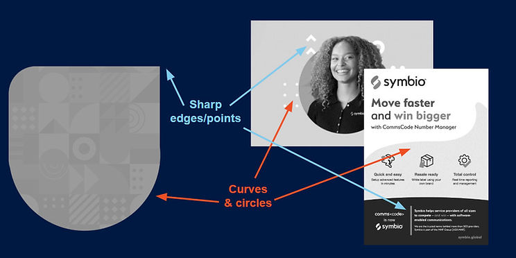
I made sure the background shapes and assets have a mix of curves and sharp edges to reflect both categories of the company (professional & approachable). I also kept a balance of soft and bold colours covered next
Strategy - Colour
Symbio's existing only colour was Red. Symbio was expanding into the APAC marketing where the most used colour is Red. In Asia red is a powerful colour symbolising luck, happiness, vitality and prosperity. This would have been a great choice, however every other brand (including competing companies) use red in their logos/brands, so we'd be launching a red logo into a sea of red logos.
To stand out from the crowd I chose to use Asia's second favoured colour Orange, representing joy, warmth and good fortune.
Strategy - Logo
Symbio's existing logo consisted of the words 'Symbio Network' which physically told viewers who and what they were. The logo also had a Yin & Yang icon. The purpose of the Yin & Yang icon was to accompany the wording, it gave an insight into who they were, it wasn't intended to spell out what they did.
For the rebrand I used the same concept, having the word Symbio and a key icon to make viewers think about who Symbio is and what they do. Thinking about the key words from above, I wanted people to see our logo and think 'linking, yin yang, communication, evolving/working together and location'.
I set up a group sketching session with marketing to see what icon ideas and concepts we could come up with that represented those words.
The idea of the session was to produce ideas, there were no right or wrong sketches, just ideas, which in turn would inspire more ideas.
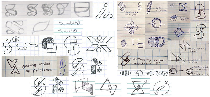
At the end of the session we'd go through our concepts, then each of us would circle two of them to work on and refine. We'd then all come back and do the process again.
After the second round I took over refining and digitalising the icons.
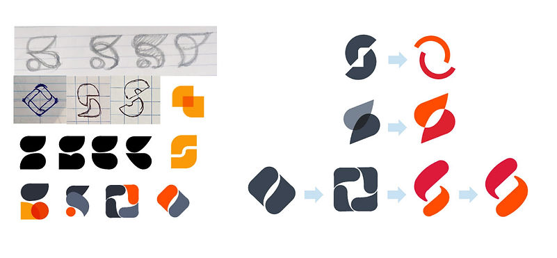
The next step was taking the refined sketches and working them into digital logos.
After a round or two of refining I presented the logos to one of the head executives to make sure the branding was consistent with the brand strategy and Wholesale Vision.
I incorporated the feedback and then presented to the CEO.
The above designs show some of the refined logos, some ideas worked in sketches but didn't have the same impact when digitalised and visa versa.
I started off the designs in monochrome to really define the shapes before adding colour.
Because the rebrand was a huge task and would impact the whole company, as a fun inclusive activity to keep staff involved, once my final two logos were designed, I presented them in a whole staff meeting, and held a vote! The staff members were able to lock in our final design. (Both designs were approved by myself, marketing, executives and CEO)

Execution
One of the best parts of the process is of course, the execution of collateral with the new branding! This was my chance to really lead and coach my creative team and marketing, getting everyone involved.
A huge part of the execution was working with the UI/UX specialist, making sure the brand colours were web accessible. We established how the colours would be used - light subtle background colours, red was only used for links/buttons, orange for bright call outs etc.
Once I'd created the brand style guide I worked closely with the mid-level graphic designer in my team, and members of marketing to execute:
Document templates, video templates, digital banner ads, social posts, EDM newsletter templates, event booth artwork, brochures, merchandise, annual report and more.
The business impact
One of the biggest parts of Symbio launching in APAC was making sure the branding done by me was respectful and appropriate in this region. By making sure I did thorough research the company avoided any cultural misinterpretations or offenses. They also made waves in the correct industry by making sure our branding made sense to what the company did/offered/produced.
Rebranding the company and making sure I worked closely the CEO and stakeholders created stakeholder confidence and trust in the marketing team. I made sure the designs I created represented the CEOs vision of what the company was and where it was going.
Growth & reflection
One of the best parts about this project was seeing all of the touchpoints a brand touches and the people I collaborated with to make sure everything was best practise.
One of the toughest parts of the project was learning the different ways to present my designs to different members of the company. Being specific to different areas of the design to show different results for the company. There's a lot going on during a rebrand that's not just in marketing, a lot of people were very busy so I had to make sure I was utilising the little time I had with different people and really refining my presentations to get results.